Feb 23, 2015

Brarracoodah

I was kinda sick of looking at the header image on my Twitter profile page, and it seemed like a great opportunity to create something that would fit perfectly in that space. Others online have been good about tracking the exact size of a Twitter header image, so it was just a matter of making something in that very horizontal layout.

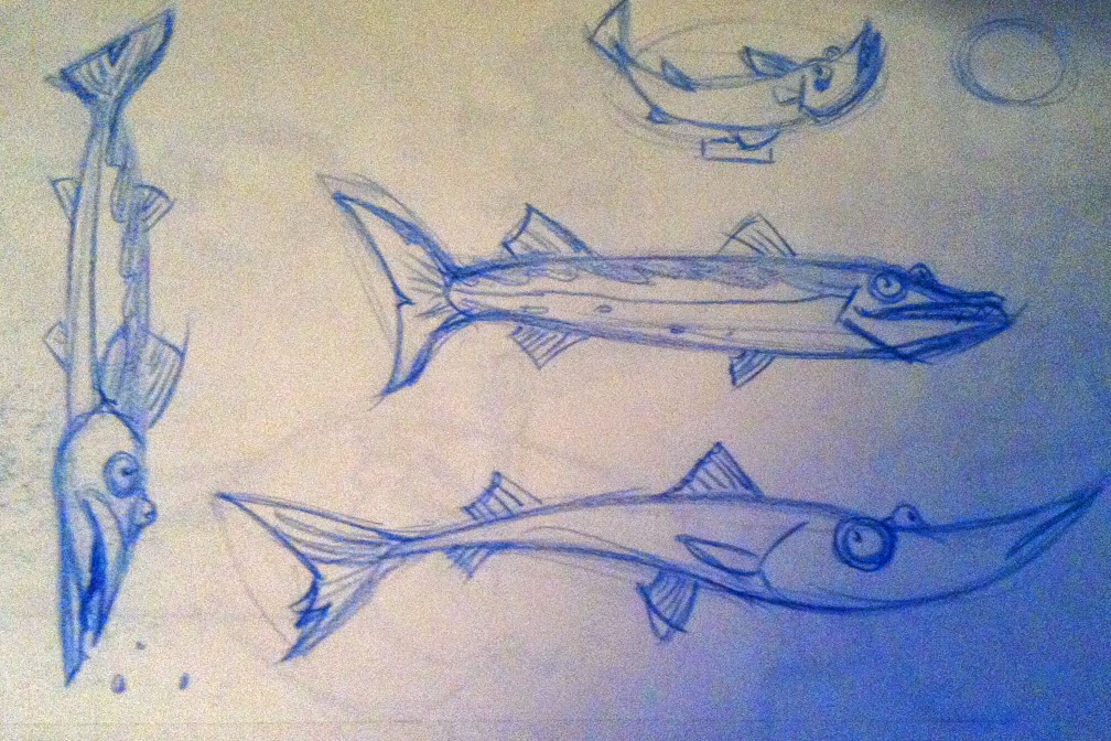
It thought it'd be fun to paint up a really long, skinny fish, and I've always liked the looks of barracudas, especially with their weird lower jaws jutting out. Even though they're super long fish, that jaw and those teeth make them feel like they're 90% mouth. So, I did a few sketched based on some random images from the internet, including some more scientific paintings I found.


From there I blocked in my colors and tried to tighten everything up. The biggest challenge was not to rely on sharp final edges when I was still getting my basic layout down. I wanted to focus on the fish as a whole and not worry about the minutiae of each edge and shape interaction. Digital art is really easy to micromanage because you can zoom in to 600% size and undo every little change you make. It was important that I treated this as more like a traditional painting. It sounds strange, but all the freedom you gain from digital art can be paralyzing if you don't have a good plan about how to move forward with a piece.

That being said, when I got some general idea of a clean, colored form, the details started adding up, and eventually I added final lines over everything. This meant I didn't really need tight colored shapes at all, since they were getting covered by those lines anyway. And the lines themselves weren't finitely detailed or perfectly sharp, they were just added with the paintbrush tool.

The background came much easier than the fish, maybe because I knew it needed to be simple and a little abstract. Believe it or not, the hook in his mouth was a last-minute addition. It seems like that'd be something added in right away, but I didn't even think of it till I walked away for a few hours. Seeing it again after that break triggered that idea immediately. That's a good lesson too; always walk away from a project and come back with fresh eyes, if you've got the luxury of time.


(Click for the big fish)


Until Next Time.

Feb 15, 2015

Under Water

I wanted to overhaul the background on my Twitter page, and I thought it'd be fun to do a really skinny vertical image that would work well with the vertical layout of Twitter. Doing research on max screen sizes I learned that the new Twitter layout gives everyone a blank white background. Bummer.

Still, I liked the idea I had, so I fleshed it out just for fun. This was a rare instance where I came in knowing exactly what layout I wanted and executed it in the same afternoon that I started it. Usually these things end up getting drawn out to multiple afternoons, making tiny changes here and there. It felt great to just sit down and finish something, beginning to end, in a single chunk.

The real only roadblock I had was the seaweed, which originally started as just some abstract green lines. I felt like they looked a little TOO simple. I kept pushing their volumes and colors with a nifty leaf brush in Photoshop. Also I originally had an ocean floor on the very bottom, and ended up axing that. This change, in combination with the strong light slice towards the top, helped push this to a level I was happier with.


Until Next Time.

Feb 1, 2015

Greedo!

Out of nowhere I'd gotten the urge to sketch some tertiary Star Wars characters. A lot of them have such fun designs, and thanks to the popularity of the franchise, reference materials are really easy to get.

The character that interested me the most was Greedo.


I think it was his teal/orange color scheme and his giant bug eyes. I'd never given him much thought as a character but the more I sketched him, the more fun it became to push his design elements. He's got a lot to work with: His antennas, his giant elf ears, the mohawk,the long, skinny fingers, etc. I really enjoyed pushing those elements to create something cartoony.

Greedo's only scene has him pointing and (allegedly) shooting his laser. I thought it'd be fun to play with that idea since that's what he's always associated with. The idea of him in a shooting pose with nothing but his hands in a pistol shape made me chuckle, so I sketched that out.

At first it was just some line art that I cleaned up, but I liked it enough to paint it.


Even though this essentially looked how I wanted in my head, when reached this stage, I had the impulse to polish it even more. I ditched the final line art and painted in some more details.


And, of course, now it felt like it needed a background. This is a problem I run into a little too often, where I always want to push a piece until it really feels 'finished'. This means I end up making important decisions much later in the process. For example, with this piece I now needed to build a full composition around a character. This is something that should have been figured out from the initial sketch, but the impulse to add a background wasn't there at the time.

Because of this, the background was tough to design and it took a lot of fine-tuning to get it to feel right. On top of that, it's easy to create and polish a background to such a degree that it overwhelms the initial character painting. Then it feels like the whole original purpose of the drawing is lost. So working out that balance was really tough. Also, I couldn't have done it without some excellent advice from Bob Rissetto who, as always, helped me persevere through the most frustrating parts. Sometimes the best solution for a roadblock is a second set of eyes.

I'm happy with the final piece, but it was teetering on the edge of being over-worked. In the past I've had pieces that I over-worked to the point where I didn't even like them anymore. They just felt like random pieces and colors, not a coherent whole. With Greedo I felt like I was able to avoid that pitfall and end up with something appealing.


Until Next Time.


May 31, 2014

Space Girl

I wanted to continue practicing on stuff like my last piece. This idea came to me pretty quickly, but as it often happens, the execution slowed it down more and more. 

The initial sketch came out almost right away, but the more I refined everything, the longer it took. The only way to keep that beginning momentum is to just keep practicing.


Here's the initial sketch:


 Which was then cleaned up:


And then painted. I hadn't initially planned on giving her gun a really long cord, but the way her opposite hand was posed made it feel like a logical improvement to the overall composition and silhouette :


I kept the canvas horizontal because I wanted her look off to the right to draw the eye over the rest of the piece. The background turned out to be the most challenging part; there were so many variations of shapes and colors in different iterations. Eventually I settled on something simple that still gave off an 'outer space' atmosphere:


After trying this initial one there was still something that felt off. I felt like the background started to take focus from the illustration, so I tweaked it further until I found something that felt like a better balance:


Until Next Time.

Apr 24, 2014

Happy Girl

I've been pushing myself to draw more people lately. It's too easy to fall back on sketching monsters and animals, and they're not nearly as challenging as designing an appealing-looking human character.

I referenced quite a few cartooning, pinup, and figure drawing tutorials and sketched like crazy. Eventually I came up with something I thought was pretty appealing.

Here's my initial sketch:


I cleaned these lines up and made a few tiny tweaks here and there until I had some final line art I was happy with:


I wanted to color it more like a comic, so I kept my colors simple and flat. One thing I was excited to try was to color the lines themselves. I really helps push some of the features of her face. Here's the final paint version, with some simple shading:


I was also excited to play around with some comic book-y backgrounds; something with simple shapes and patterns. I also though it'd be nice to see what exactly this girl is looking at that's making her so happy, so I added a happy little flower too.


Until Next Time.

Mar 11, 2014

Minions!

Recently I visited a few people in NYC who have young kids. I brought along a drawing, hoping it'd be a nice gift from the out-of-towners. I remember loving the custom gifts I got as a kid, so it seemed fun to pay it forward.

I'm pretty out of touch with what kids are into these days, but I gambled on the Minions from the Despicable Me films. Everybody loves those guys, myself included. Plus, they're fun to draw. My goal for this was to keep it simple and fun, much like the spirit of the characters. I felt lucky that the characters themselves were designed with simplicity, and most often their character posters were just on a white background. I've always loved how the designers proportioned these guys, and how they kept details sparse to enhance their body language. Knowing this stuff helped me streamline the piece quite a bit.

My idea was to have two Minions on a simple white background, each holding a balloon. This was a nice, simple composition that still left some opportunities for cute character details.

First, I looked for reference images. Mostly I was referencing details on their costumes, like how their goggles and hair looked. Also, I wanted to see how the animators posed them out, since I wanted mine to be arcing their backs a bit. It was interesting to see how they handled the 'spine' of these guys, since they're essentially gumdrops with arms and legs.


I knew this was gonna get printed out, so I made sure to create the image at 300 dpi and CMYK color. I rarely ever have this kind of foresight, so it felt good not having to scramble with formatting right before I printed. Working with CMYK colors can be a pain, though; it's very limiting. Sometimes it's easier just to create your image in RGB and adjust when the piece is complete.

The next step was to sketch them out, so I played around with some different characters, costumes, and poses and eventually landed on these two.


I decided to create the final lines in Flash, where you can get a thick, clean final line that stays nice and sharp because you're dealing with vectors instead of pixels.


Once I was happy with those final lines I blocked in my colors in Photoshop and began adding in little details. I didn't want to make it too detailed or polished, so I stopped myself after the subtle highlights and shadows.


I was happy with how these turned out, especially since I didn't labor over them for weeks. I know for sure the fun would've been sucked out of the piece if I tried to make it too polished and perfect. The kids loved them too, which was a great payoff.


Until Next Time.

Feb 25, 2014

Mars Attacks!

Recently I've gotten a Contiq, Photoshop CS6, and a whole bunch of new brushes. I was eager to experiment with all these different tools.

I started just by sketching for fun, and eventually I drew a Martian from Mars Attacks! There was really no intention to make this into any kind of final piece, it was just me monkeying around.


I liked the drawing enough that I wanted to clean up the line work instead of just painting that initial draft. That's something else I've been training myself to do; not settling for an initial sketch as my blueprint. Drawing over and refining a sketch can improve it in a hundred little ways that we wouldn't even think about.


 I then painted it all up, treating it almost like coloring a line drawing for a comic strip. The biggest challenge here was most definitely the brain folds. I looked over a lot of the original Mars Attacks! cards to see how they handled it, which helped a great deal.


I decided it deserved a better background, so I kept adding and tweaking  ideas until I ended up with this final piece. The end result is a combination of a ton of different brushes, mainly the pencil and the chalk, with some ink marker thrown in. There are also quite a few vector shapes and specialty patterns hidden in there too.


 It was a surprising challenge to design a full background around a drawing that was initially done on its own. There was quite a bit of back-and-forth to make sure the Martian actually fit into his surroundings. Picking a dominant color definitely helped, and I was lucky in that the setting (the very red planet Mars) was an obvious one. I had fun making the background elements extremely subtle to my character wouldn't get lost in the shuffle.

The last step was to add a subtle text treatment and a border to really make it feel 'finished'. Overall it was a very encouraging experience and I'm eager to jump into the next fun experiment.


Until Next Time.