May 31, 2014
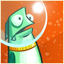
Space Girl
Apr 24, 2014
Happy Girl
Mar 11, 2014
Minions!
Recently I visited a few people in NYC who have young kids. I brought along a drawing, hoping it'd be a nice gift from the out-of-towners. I remember loving the custom gifts I got as a kid, so it seemed fun to pay it forward.
I'm pretty out of touch with what kids are into these days, but I gambled on the Minions from the Despicable Me films. Everybody loves those guys, myself included. Plus, they're fun to draw. My goal for this was to keep it simple and fun, much like the spirit of the characters. I felt lucky that the characters themselves were designed with simplicity, and most often their character posters were just on a white background. I've always loved how the designers proportioned these guys, and how they kept details sparse to enhance their body language. Knowing this stuff helped me streamline the piece quite a bit.
My idea was to have two Minions on a simple white background, each holding a balloon. This was a nice, simple composition that still left some opportunities for cute character details.
First, I looked for reference images. Mostly I was referencing details on their costumes, like how their goggles and hair looked. Also, I wanted to see how the animators posed them out, since I wanted mine to be arcing their backs a bit. It was interesting to see how they handled the 'spine' of these guys, since they're essentially gumdrops with arms and legs.
I knew this was gonna get printed out, so I made sure to create the image at 300 dpi and CMYK color. I rarely ever have this kind of foresight, so it felt good not having to scramble with formatting right before I printed. Working with CMYK colors can be a pain, though; it's very limiting. Sometimes it's easier just to create your image in RGB and adjust when the piece is complete.
The next step was to sketch them out, so I played around with some different characters, costumes, and poses and eventually landed on these two.
I decided to create the final lines in Flash, where you can get a thick, clean final line that stays nice and sharp because you're dealing with vectors instead of pixels.
Once I was happy with those final lines I blocked in my colors in Photoshop and began adding in little details. I didn't want to make it too detailed or polished, so I stopped myself after the subtle highlights and shadows.
I was happy with how these turned out, especially since I didn't labor over them for weeks. I know for sure the fun would've been sucked out of the piece if I tried to make it too polished and perfect. The kids loved them too, which was a great payoff.
Until Next Time.
Feb 25, 2014
Mars Attacks!
Recently I've gotten a Contiq, Photoshop CS6, and a whole bunch of new brushes. I was eager to experiment with all these different tools.
I started just by sketching for fun, and eventually I drew a Martian from Mars Attacks! There was really no intention to make this into any kind of final piece, it was just me monkeying around.
I liked the drawing enough that I wanted to clean up the line work instead of just painting that initial draft. That's something else I've been training myself to do; not settling for an initial sketch as my blueprint. Drawing over and refining a sketch can improve it in a hundred little ways that we wouldn't even think about.
I then painted it all up, treating it almost like coloring a line drawing for a comic strip. The biggest challenge here was most definitely the brain folds. I looked over a lot of the original Mars Attacks! cards to see how they handled it, which helped a great deal.
I decided it deserved a better background, so I kept adding and tweaking ideas until I ended up with this final piece. The end result is a combination of a ton of different brushes, mainly the pencil and the chalk, with some ink marker thrown in. There are also quite a few vector shapes and specialty patterns hidden in there too.
It was a surprising challenge to design a full background around a drawing that was initially done on its own. There was quite a bit of back-and-forth to make sure the Martian actually fit into his surroundings. Picking a dominant color definitely helped, and I was lucky in that the setting (the very red planet Mars) was an obvious one. I had fun making the background elements extremely subtle to my character wouldn't get lost in the shuffle.
The last step was to add a subtle text treatment and a border to really make it feel 'finished'. Overall it was a very encouraging experience and I'm eager to jump into the next fun experiment.
Until Next Time.


