Dec 21, 2010

Martian Marc


This is a big one.

I regularly listen to a podcast called 'WTF', hosted by comedian Marc Maron. I'd go as far as to say it's my favorite podcast on the whole darn internet. I love it mainly for its host, Mr. Marc Maron himself. He's got a wonderful rapport with all his guests and I appreciate his perspective on the world and his way with words.

A while back I was listening to an episode that really caught my attention: The beginning features Marc reading off psychological symptoms from a lengthy checklist. What made this bit soar is that he would fire off little improvised reactions to EACH ITEM on that list. It was rapid-fire, witty, and charming. I daydreamed about what it would be like to construct a bit of animation based on that audio.

Fast-forward to a few weeks later, where I've got a sparkling new piece of animation to show you all. I ran with the idea of a character reading off a checklist of conditions and quickly reacting to each one. I took the idea a step further and had him pop to a new environment for every reaction. I wanted to make this feel pretty manic overall, while still anchoring the 'reading' sections so the audience still knows what's going on. So here's how it all came together:


First up, here's the actual piece:


(YouTube is cutting off the right side off this video. To see the full thing, go here)


Here's the initial character comp:
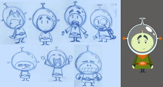


Here's a sampling of the rough pose sketches:
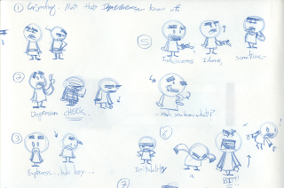


After I chose my favorite poses, I scanned them in, popped them into AfterEffects, and edited them with the dialogue. Here's the final rough pose test:


(Again, to see the full-frame version, go here)


Here are some of the mouth shapes made to match those poses:


A sampling of the different backgrounds I used:


After that was all compiled I popped it back into AfterEffects for some final text/effects work (mainly on the jetpack). Overall it was a lengthy process, but also a very important learning experience. Thanks to my buddies Bob and Ian for giving me so much support and invaluable tips along the way.


Until next time.

Nov 15, 2010

How Blue Was My Robot

Here's another small update for ya.

I wanted to make a birthday card, but I forced myself to do it differently. Normally I'd sketch out design variations until it was perfect, scan it in, trace the line art in vector, spend lots of time fooling with the color palette, composition, and techniques, etc.

This time, I made myself just dive in and paint in Photoshop. Needless to say I felt a lot more freedom with this one; like there was no pressure for getting it EXACTLY RIGHT. Dare I say, it was actually fun.

The only challenges I gave myself were to keep it in a very limited color palette and to sneak the phrase "Happy Birthday!" in there.


Until Next Time.

Oct 18, 2010

Rocket, Rocket, Rocket, Rocket Scientist

...but she's just like the second law of thermodynamics...


Anyways, I'm back with another piece. This one was made as a gift for a friend's wedding; I wanted to make something personal, since he's an old friend of mine. Bed, Bath and Beyond just wasn't cutting it.

Apropos of nothing, I thought it'd be fun to make him a space-age rocketship looking like it came from some old comic book. You might think it had something to do with the wedding, but...no. It was kinda just for fun.


I started with the sketch, and hoo boy were there a lot of sketches. I had only a vague idea of how this should look, so I played around with different angles for the rocket and exactly how the background should look. My main idea was to feature the rocket in a heroic 'blast-off!' pose, with old comic book-y action lines. Here are just a few...


Eventually, with a lot of sketching and Google image references, I came up with this...


Now there was quite a bit of cleanup work to do. I brought the sketch into Flash where I could clean it up (just solid colored shapes)...


I took the cleaned-up rocket and brought it into Photoshop where I could assemble a rough version of how the details and the background should look...


Through more consultations and advice from co-worker and A-1 helper guy Bob Rissetto I tweaked everything from the colors to the background layout and the details. From there, it was back into Flash to finalize the rocket...


And finally back into Photoshop to lay out all the comic book-y details. Photoshop has an excellent filter that manipulates solid colors into colored dots. Perfect for that comic book style. I was also able to track down a folded paper texture from the internets and use that as an overlay. Most people who saw the final image thought I'd actually folded the paper.


Anyways, after a lot more tweaking with the filters, colors, and background 'light rays', I got to a satisfying place. I looked to old comic books for more ideas, and they inspired me to add a white border, 'page number' (the date they got married, Oct 16th), and text box...


In the end I was able to print this out at 11x17, frame it, and hand it off with a ribbon tied 'round. This whole process actually went much quicker than the Robofish, and I think I like this end product better. It's a good lesson in giving yourself strict time constraints. Then the projects won't just keep crawling off into uncharted territory...


Until Next Time.

Sep 25, 2010

The RoboFish Procedure

Well, I'm back for an update. It's the first big thing in a while that I felt was worth posting. I wanted to track a drawing from initial idea to final version, so here's my attempt at being thorough...


The initial idea just came from something I doodled absentmindedly in my sketchbook. I liked how it was shaping up, so I rendered it a little further, then scanned it in...


The idea was to make some kind of mechanical angler fish.


Next, it was a matter of cleaning this up, so I opted to trace it in Flash. While I worked, I kept adding more dimension and shininess. The fish went from a simple sketch to this shiny, semi-3D behemoth. After that whole process, I ended up with this...


I wasn't UNhappy with it, but it didn't look like the polished version of my original sketch. Felt a little off. Plus, I had no idea where to take it next, which was frustrating, since it was clearly unfinished.

Luckily, I was able to turn to my coworker Bob Rissetto for a little direction. He was nice enough to look at the fish and provide TONS of helpful feedback. We went back and forth with a few different options of where to go next, and here's what I got...


Muuuuuuch better. I felt like it had really been taken to the next level. Overall, it just felt so much more...complete. It helps to have someone else holding me accountable to these changes, too. It's possible I would've let this die had I not asked for some help. Sometimes you really need other people to throw their hats in the ring to keep the ideas flowing. Thanks, Bob.

But, let's not get ahead of ourselves. It still wasn't totally there. Was the fish just gonna float in the blue nothingness like that? And what about all the little details? Was I sure every little change was improving it overall? How about those colors? The more tedious questions popped up after I'd done the initial design work.

I hammered out a background and changed a few more little things here and there based on further conversations Bob and I had. Eventually this popped out...


Suddenly things felt so close to the finish line. It didn't feel finished because I was dry on ideas, it just honestly felt COMPLETE. There's a big difference, and I'm really trying to recognize the difference in my work process. Of course, you can ALWAYS change something, so there were a few more minor alterations. I wanted to make proof positive that when I stared at this thing I was comfortable calling it 'finished'. In the end, I got this guy...


Now it's all wrapped up and I can finally blog about the experience. This whole process took a little longer than I'd like to admit, but I took a few lessons away that can ensure a more streamlined process in the future. On to the next one...


P.S.

Oh, and I apologize I couldn't articulate the changes made between the versions more specifically. I can't really remember every little thing that was changed, but if you feel like playing detective, the pics are right up there.


Until Next Time.